CSS grid - difference between min-content, max-content and fit-content () keywords

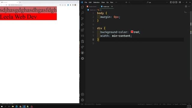
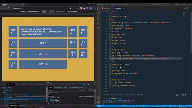
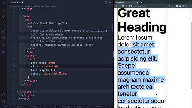
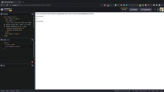
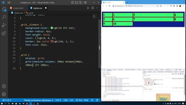
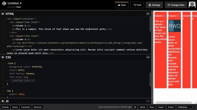
Hello, We can use min-content, max-content and fit-content to size text and grid tracks. Example # 1 (no grid) To understand the difference between min-content, max-content and fit-content, lets take a look at some text within a div which is inside container with .no-grid class - if there's no sizing, because our div is a block level HTML element, it just stretches across its container to fit the width of 100px (or whatever width we put on the container) - if we give our div with text width: min-content; the div would shrink to fit the widest (longest) word in that text .no-grid div { width: min-content; } - if we give our div with text width: max-content; and add more text, the div would expand to fit the whole text string. Now if we keep adding more text, the text within our div wouldn't wrap and would eventually overflow the container .no-grid class .no-grid div { width: max-content; } Example # 2 (grid) Now lets take a look at how we can use min-content, max-content and fit-content keywords to control sizing of our grid tracks. We have container with class .grid with 7 divs inside it div class="grid" ****** - if we give our 1st column value of min-content; like so grid-template-columns: min-content 1fr 1fr; the 1st column would shrink to fit the widest (longest) word in that column (same behavior as in our previous example without grid with a string of text) - if we give our 1st column value of max-content; like so grid-template-columns: max-content 1fr 1fr; the grid item would grow to fit the whole text as one line and eventuall would break (overflow) the container (e.g. Lorem50) -we can also use fit-content keyword. this keyword should have length value assigned to it (length unit - px, em, rem or percentages) fit-content (10rem) the way fit-content works is that grid item would keep growing untill it hits the width value defined (10rem) and then text would start to wrap.